A Criticism on Sin City - Family Values
09 Mar 2017
What follows is originally an assignment for school, posting it only after I submitted the assignment. Plus, only posting the bits where I was the main author of.
The general style of the comics series Sin City is very film-like. To be more specific, it’s more or less drawn as if it’s inspired by a film noir crime thriller/action movie. The plot is like that, but the general white-on-black style of the comics adds a lot to that effect.
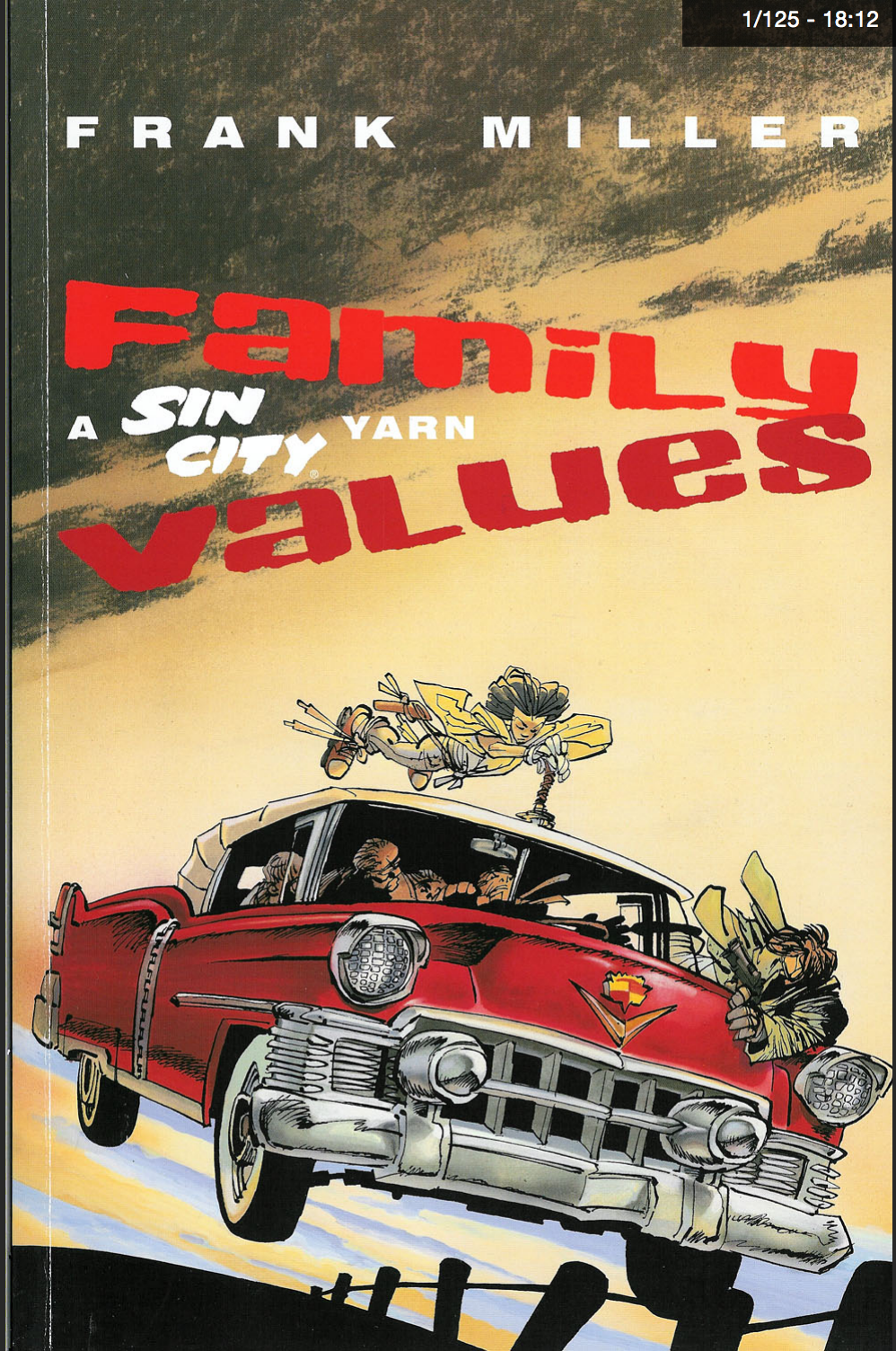
Cover of Sin City: Family Values
In comic books, perhaps in all visual arts, in general, creators tend to use a ‘darker’ style for a more adult-like, grittier atmosphere. For the Frank Miller and many other comics artists, using that as a personal style might make the final product seem less like one aimed at children (which unfortunately exists as a common stigma against comics in the general populace).
Another notable feature in the books is that the author uses a lot of line-shadings in the art, and those lines are very erratic. This style looks like the shadings were done in a hurry, and it gives a significant ‘eerie’ sentiment to the final work; which contributes a lot to the thriller movie like atmosphere. This decision might not be a very intentional one, as it’s generally easier to do it that way if you’re doing a lot of shading like Frank Miller does, but the fact that there seems to be very deliberately drawn white splotches on otherwise plain-black colored objects (like the two characters on page 26) suggests otherwise.
The character ‘Miho’ is drawn in a different style from the rest of the book (and apparently, different from how she is drawn in other installments of the series). She still retains a ‘hastily drawn’ look similar to all the shadings in the book, but is drawn in all-white, in a more line art-like style. That might be both in order to increase the general contrast of the book where the majority of characters are in black, with only white highlights where a light source hit them; or in order to emphasize her speed, which is significantly higher than the rest of the cast when she is moving via roller blades.
The author doesn’t seem to use any movement lines but tends to use borderless frames to suggest that some objects are moving (like the car + Miho in page 42). This decision might be an intentional one to support the film noir like look in the book or just an unintentional stylistic decision of the author. Also, even if the graphic novel goes for a film-like look; it has a general lack of aspect-to-aspect transitions, unlike most Anime and in accordance with most western comics.